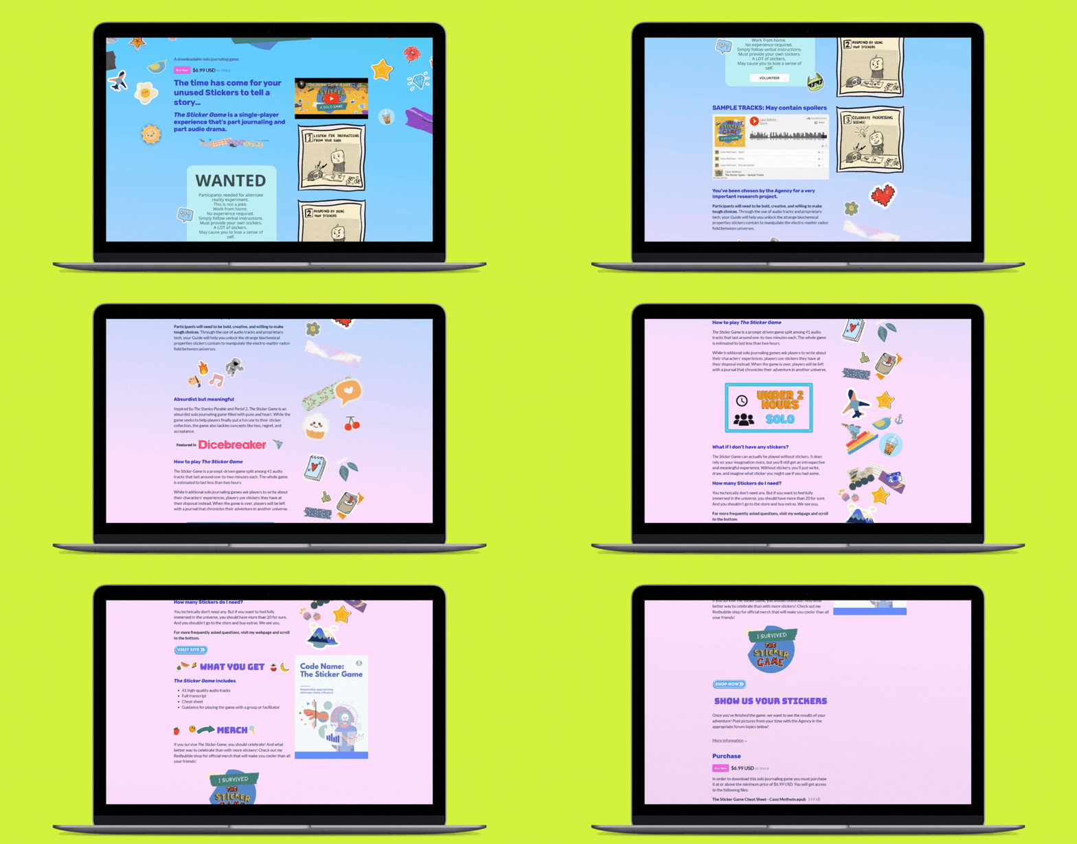
I recently discovered how to jazz up my Itch game pages with CSS, and I figured I’d share. This is a pretty simple process, but it did take some tweaking for me to get it exactly the way I wanted. I hope this helps make the process easier for others!
1. Email Itch Support
To unlock CSS editing on your account, Itch has to do something on the backend. Go ahead and email them and request CSS permissions be unlocked on your account. You can find more information about how to request access on the bottom of this page. This isn’t a big deal. Just email them and say you want to add some gradient backgrounds to your game pages. They just want to make sure you aren’t going to make your pages completely chaotic. It can take several weeks for permission to come through. I think it took them about three weeks to unlock CSS on my account.
2. Upload any background images you want
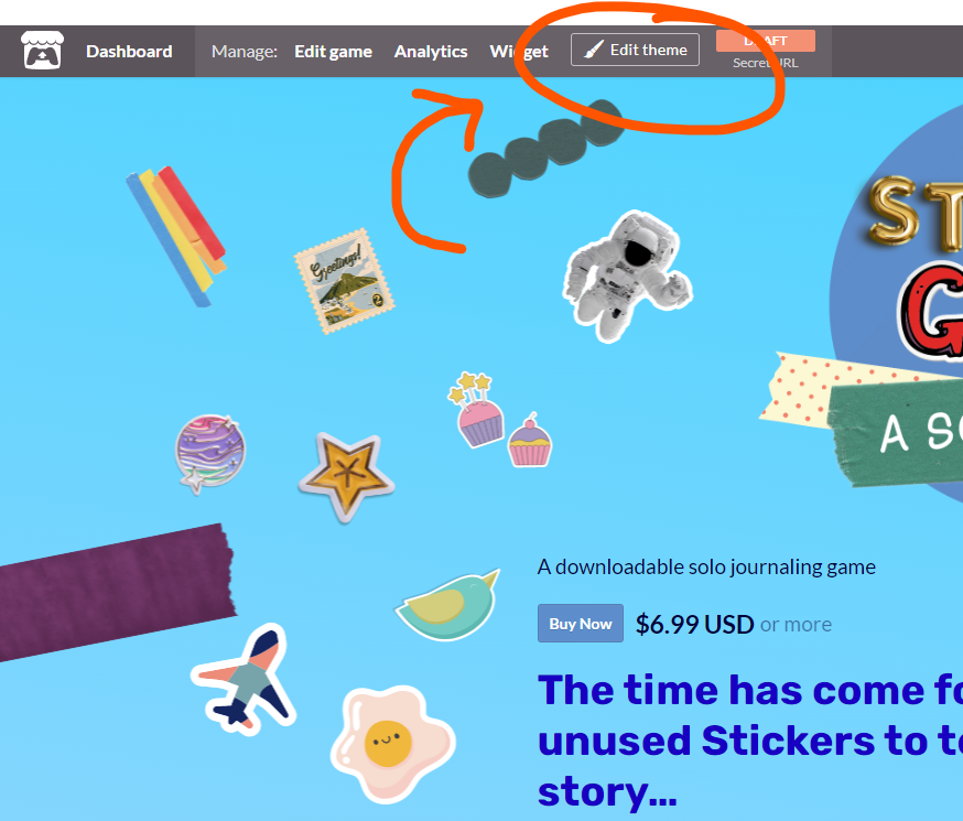
Navigate to the game page you want to edit. On the game page, select “Edit theme” in the header.
You can make a lot of adjustments in this Edit theme section, but don’t get distracted by the choices until you’ve locked your background down. You’ll want to make sure your text and headers are readable on the new background.
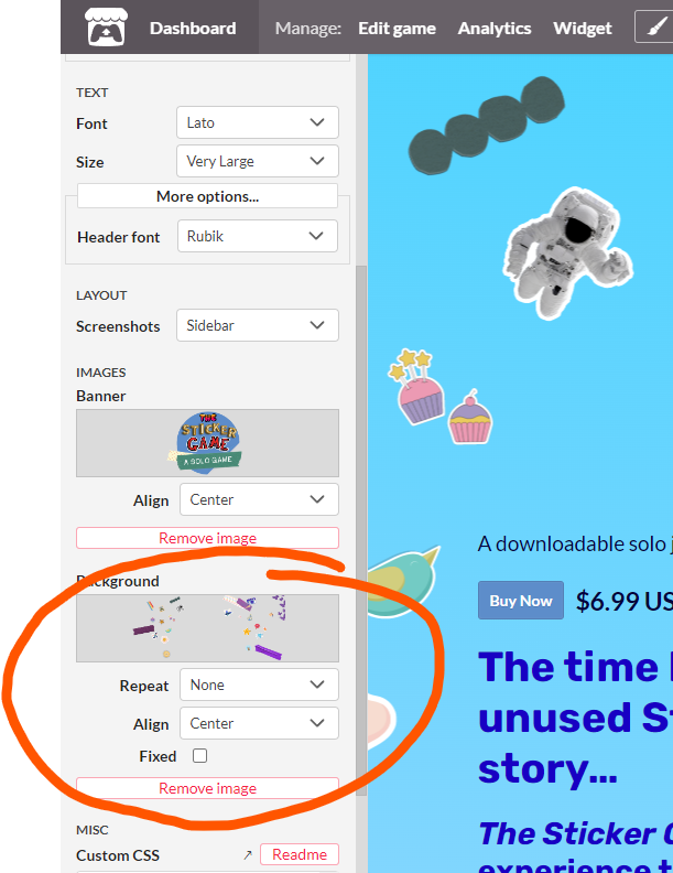
In the left bar that pops up, scroll down to background. Here’s where you’ll upload your background image. If you want your gradient to show through, the image needs to be a transparent png.
3. Get the image URL (I’m using Google Chrome)
Once we edit the background with CSS, it will override what you’ve uploaded to the editor. So let’s find your image URL so you can add it on top of the gradient. Scroll to the bottom of the editor and click save so that your background image shows up.
Next, click F12 or right-click the page, and select “Inspect” at the bottom of the menu.
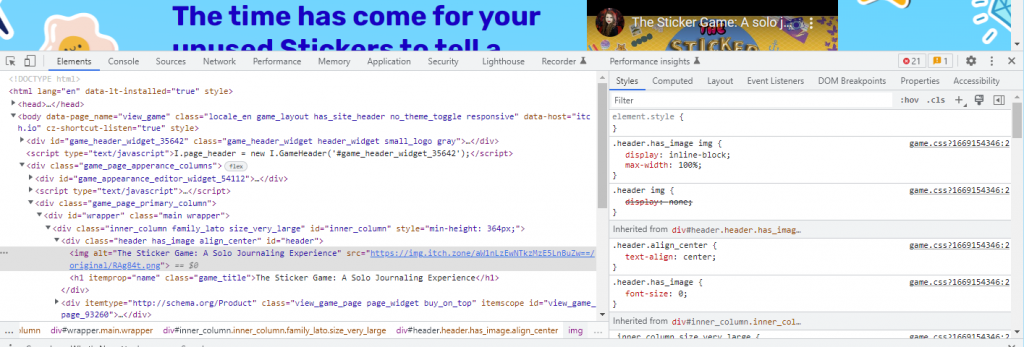
You’ll see a menu with a lot of code. What we’re looking for here is the URL of the image you just uploaded. To find it, go to the styles tab and scroll to the #wrapper section.
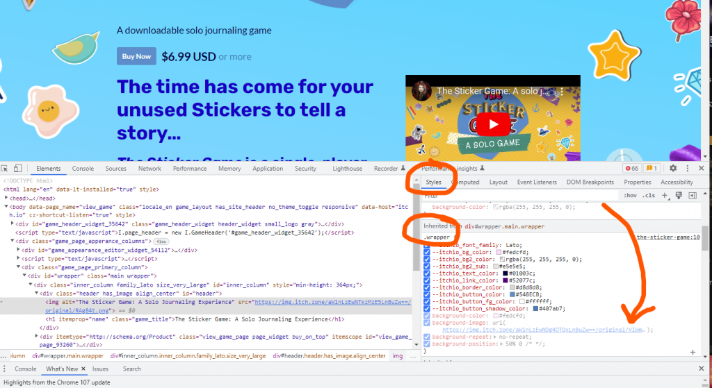
Within the wrapper section, you’ll see the URL of the image you just uploaded. Go ahead and copy and paste that somewhere for later.
4. Build your gradient
I have little to no experience with CSS, but this site makes it easy to create a gradient that matches your aesthetic: https://cssgradient.io/
Here are the settings I used:
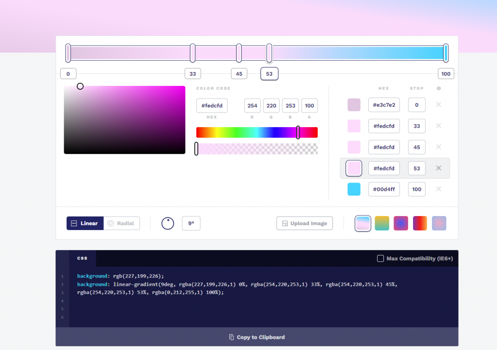
Once you like the gradient preview, grab the code this tool produces by clicking “Copy to Clipboard.”
5. Build your code
This section of the Itch page is inside the wrapper, so that’s where we’ll tell Itch to put it with #wrapper. We’ll also create a fallback in case someone is using an outdated browser or equipment and the gradient won’t work.
First, choose a solid color to be the background of your page if the gradient won’t work. You can choose one in the “Edit theme” menu and copy the code.
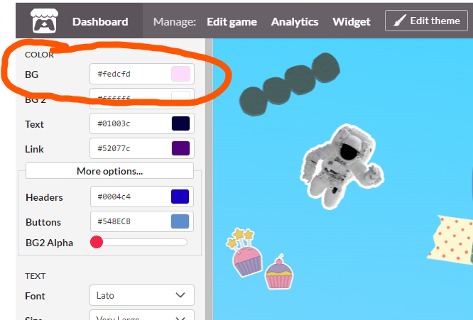
Whatever color you choose, put your color code where I have: #fedcfd.
#wrapper {
background: (#fedcfd);
Next, let’s add our image URL so that it’s always there, even if something goes wrong. You found this in step 3.
#wrapper {
background: (#fedcfd);
  background-image: url(https://img.itch.zone/aW1nLzEwNDg4OTQxLnBuZw==/original/VIWm9w.png);
Great. We’ve created our fallback. Now for the fun part! Let’s put a gradient behind our image. We’ll first add /* fallback */ as a note to our future selves that the previous code is there for if things go wrong.
Next, we’ll add our background image URL again, followed by some of the code we copied from the gradient site generator. You’ll only need “linear-gradient” and everything after that. It should look like this:
linear-gradient(9deg, rgba(227,199,226,1) 0%, rgba(254,220,253,1) 33%, rgba(254,220,253,1) 45%, rgba(254,220,253,1) 53%, rgba(0,212,255,1) 100%);So here is what the complete code looks like:
#wrapper {
background: (#fedcfd);
  background-image: url(https://img.itch.zone/aW1nLzEwNDg4OTQxLnBuZw==/original/VIWm9w.png); /* fallback */
  background-image: url(https://img.itch.zone/aW1nLzEwNDg4OTQxLnBuZw==/original/VIWm9w.png), linear-gradient(9deg, rgba(227,199,226,1) 0%, rgba(254,220,253,1) 33%, rgba(254,220,253,1) 45%, rgba(254,220,253,1) 53%, rgba(0,212,255,1) 100%);
background-repeat: no-repeat;background-position: 50% 0;
}
And here’s a blank template:
#wrapper {
background: (#hex code);
  background-image: url(URL); /* fallback */
  background-image: url(URL), linear-gradient( XXX );
background-repeat: no-repeat;background-position: 50% 0;
}
You may want to play with the background repeating and positioning. I just google around, plugging in CSS code until items look the way I want. It’s very professional.
Once you have your code, go back to the “Edit theme” menu. All the way at the bottom, right above save, there’s a small box you can paste your code. It’s easier to edit and view the code by clicking on the small arrow next to read me.
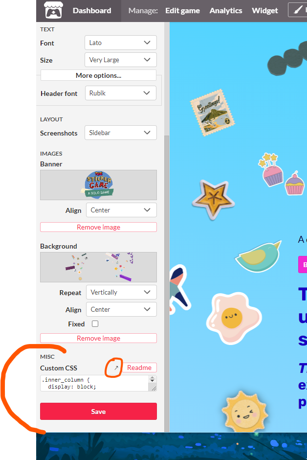
Once you’ve pasted in your code, you should get a live preview of the changes. But if you don’t, click “Save” before you panic. If it still doesn’t work, make sure you have the opening and closing brackets where they should be. These are the brackets: { }. If that still doesn’t work. Make sure that Itch turned CSS editing on for your account, and break down the code line by line.
If you found this post useful, please consider checking out my games or sign up for my mailing list and check out The Sticker Game, my single player audio drama journaling game, that releases Nov. 30, 2022!
